
Akira
Turning a chef’s point of view into a brand.
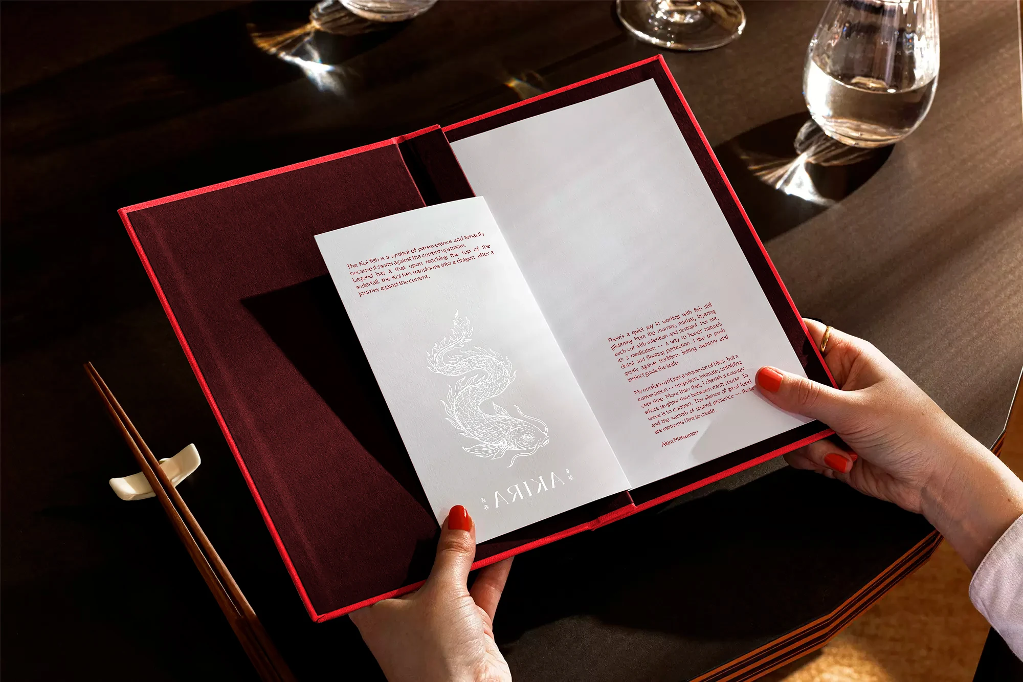
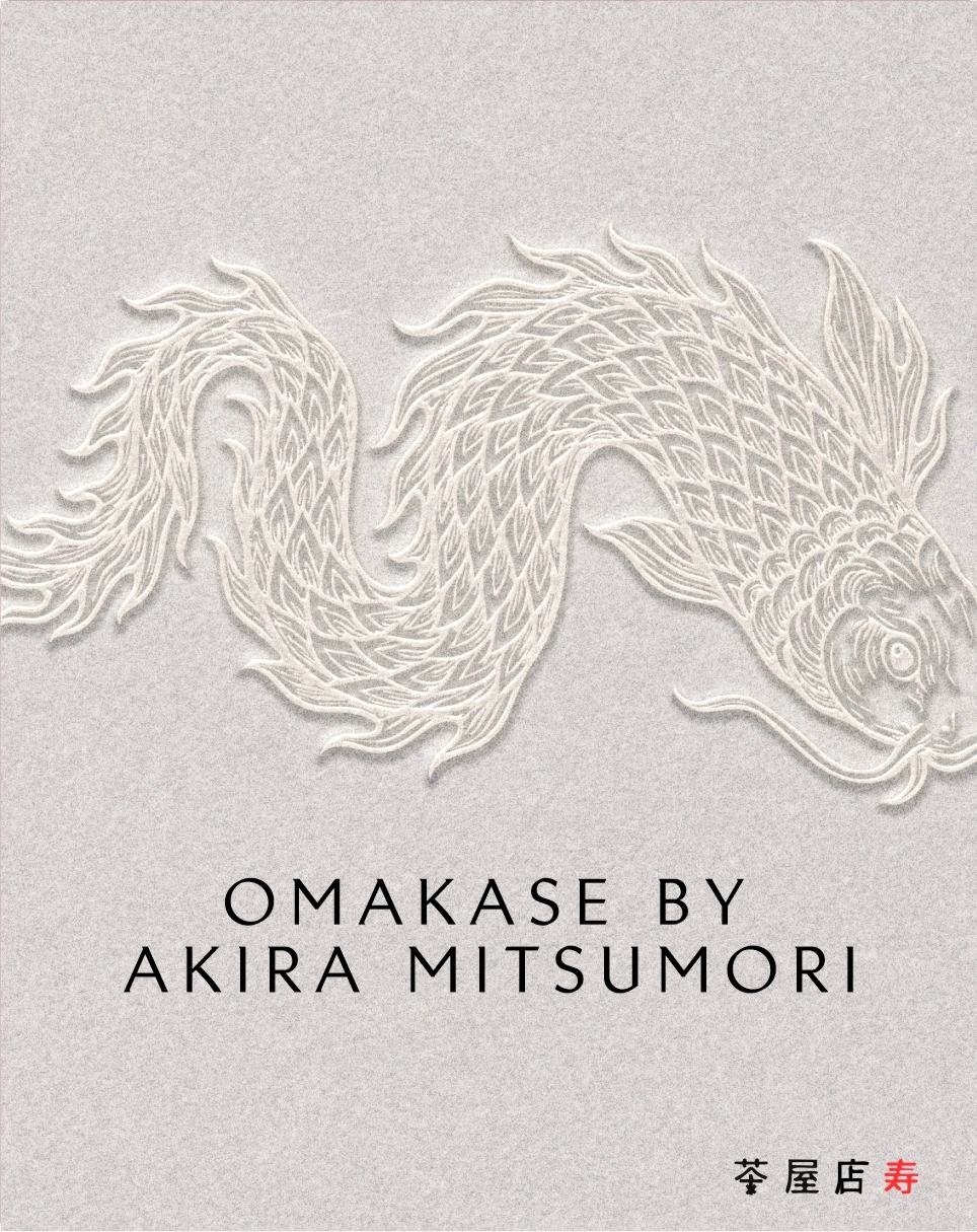
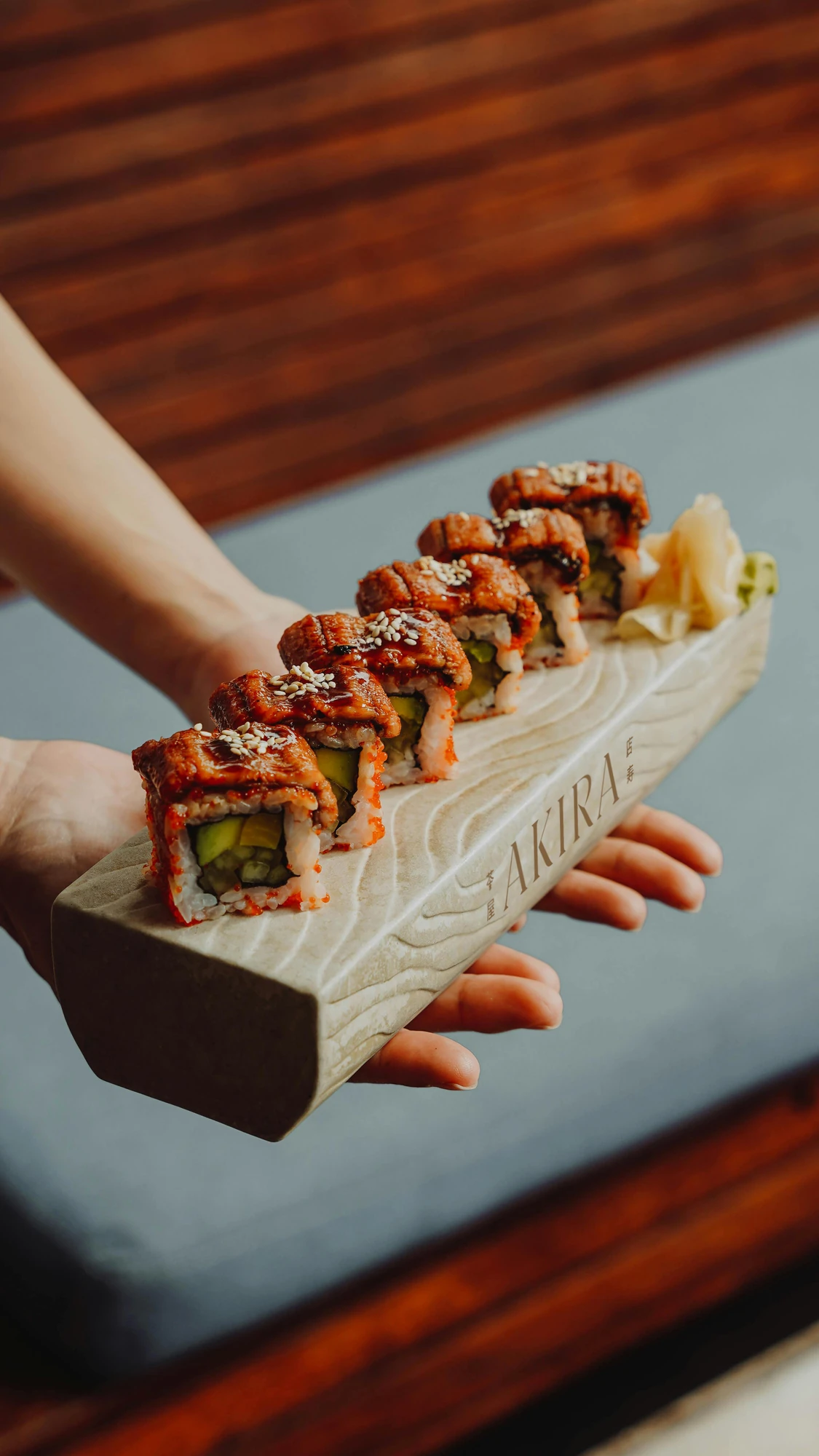
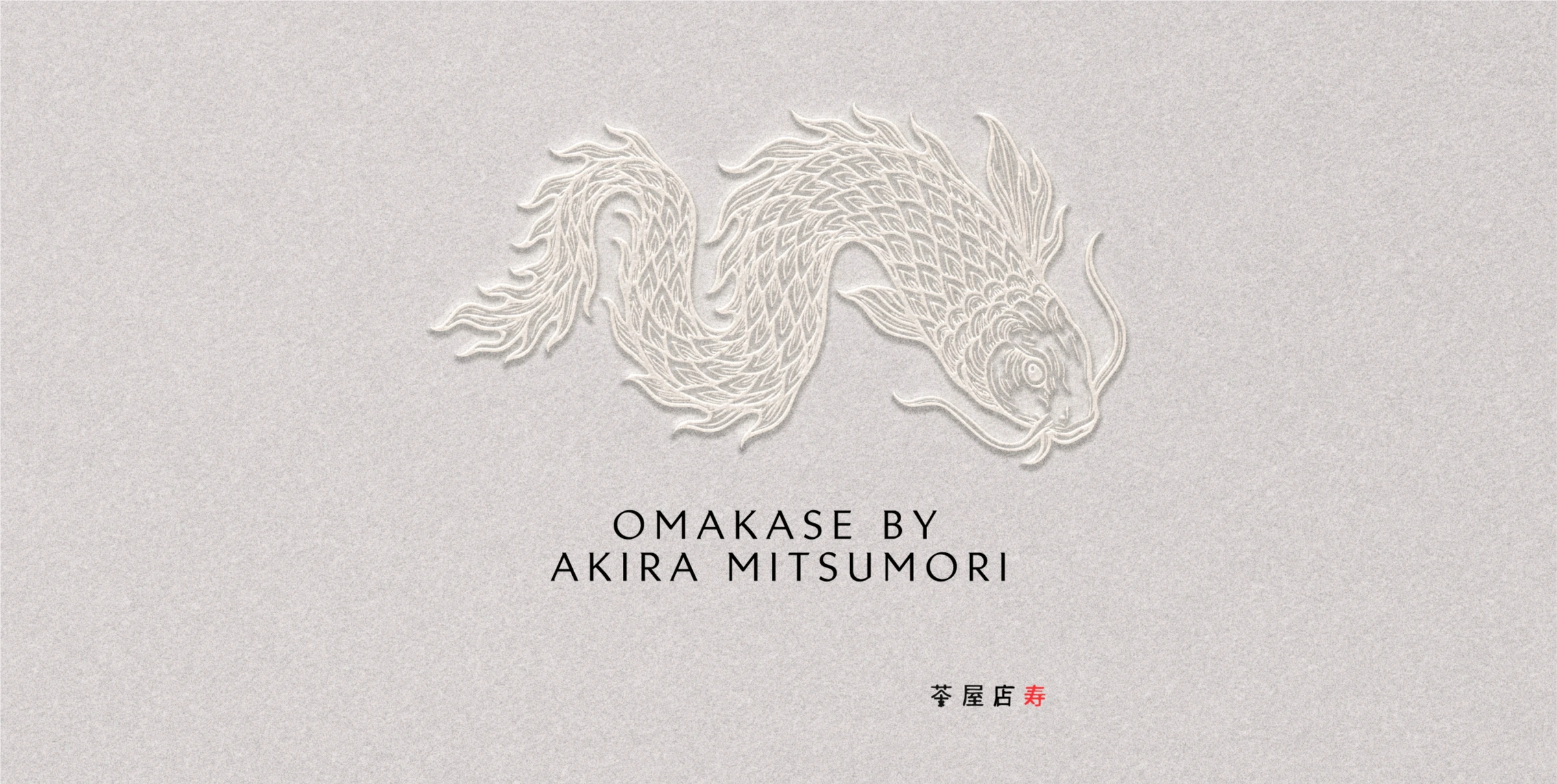
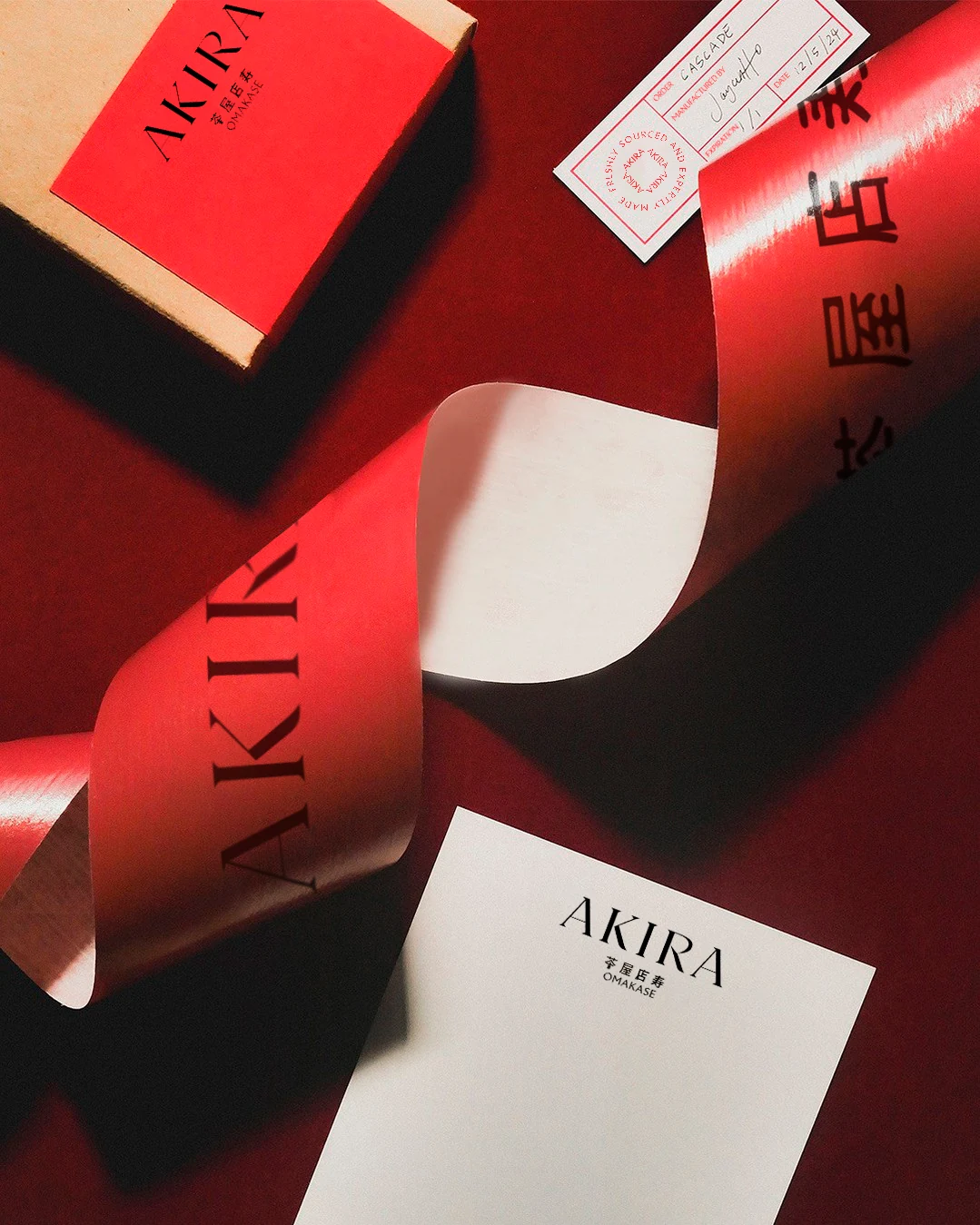
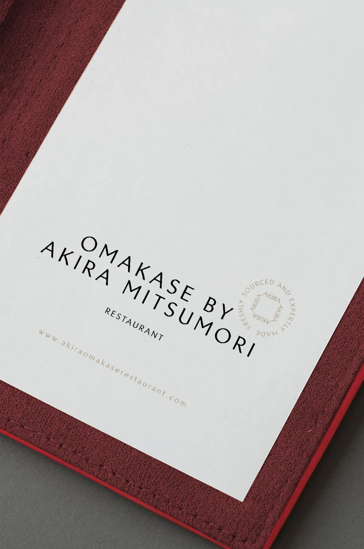
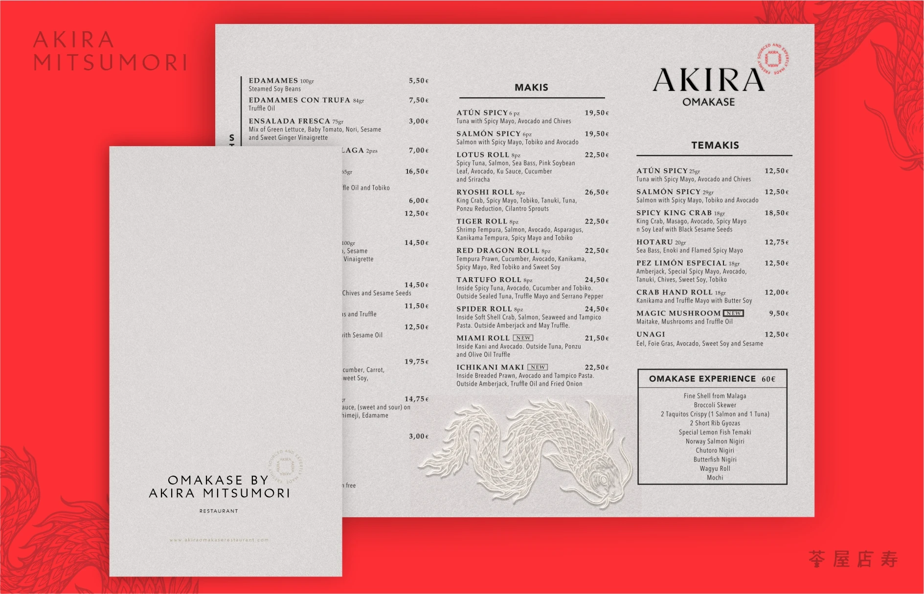
In Akira, precision, ritual, and artistry come together through the hands of chef Akira Mitsumori. The challenge was to create a brand that respected Japanese heritage while feeling contemporary and elevated. I designed a visual identity that balances restraint and refinement through clean typography, subtle textures, and a red-and-white palette. The meticulously crafted dragon emblem symbolizes mastery, strength, and protection. Every detail was designed to reinforce Akira’s ethos: excellence through simplicity, precision, and soul.
The brand challenge
Respect Japanese heritage and the chef’s craft through a brand with a contemporary sensibility.
Identity decisions
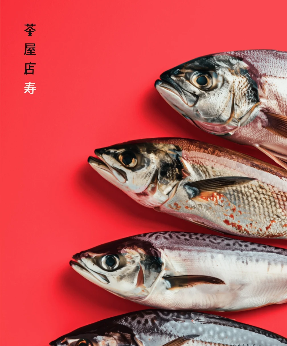
Clean typography, subtle textures, a red and white palette and the dragon emblem articulate precision and refinement.



Is your brand living up to what you’re building?
If the business has moved forward and the brand hasn’t — or you need clarity to build it right from the start — let’s talk.
Let’s talk about your project